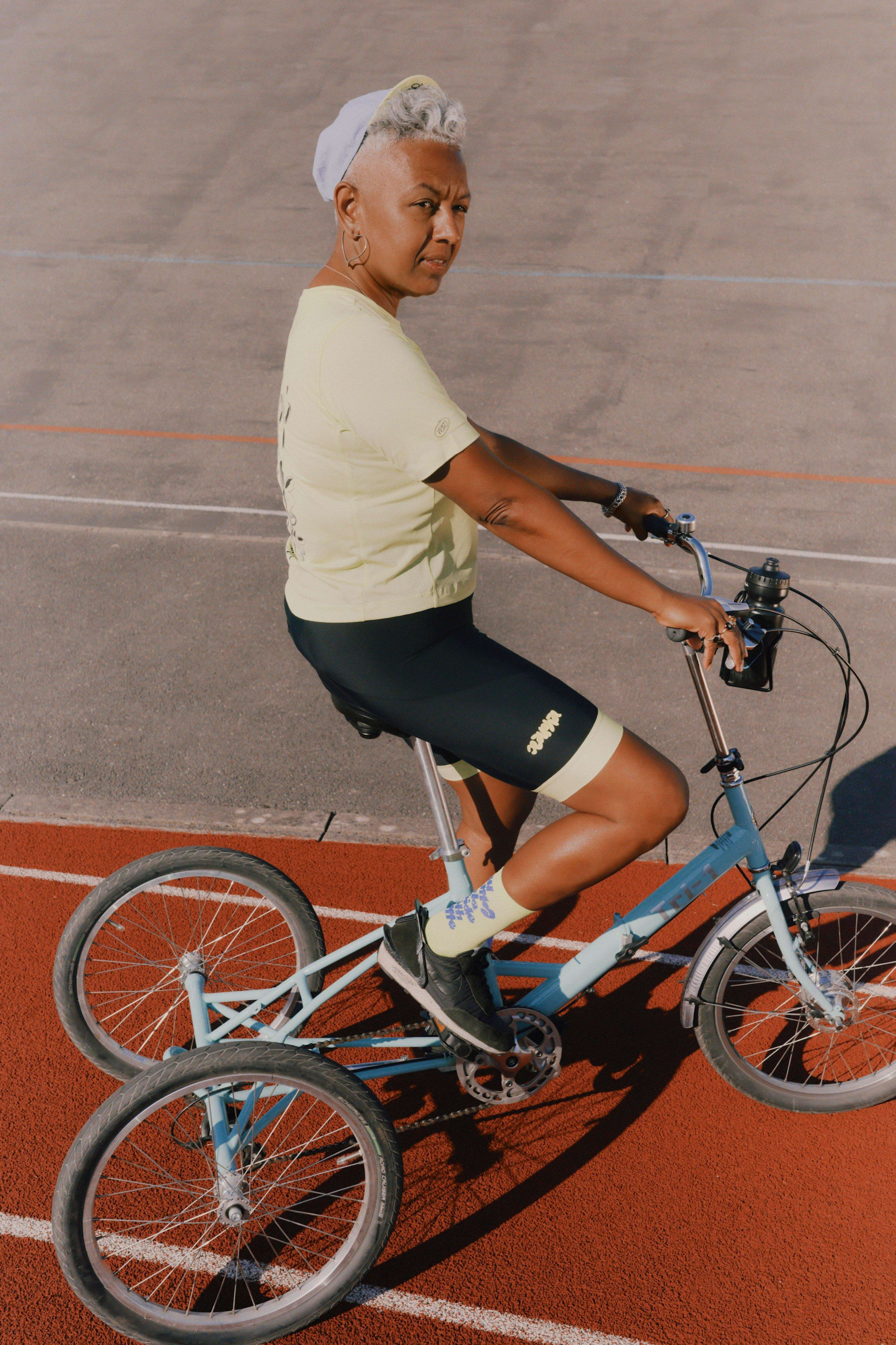
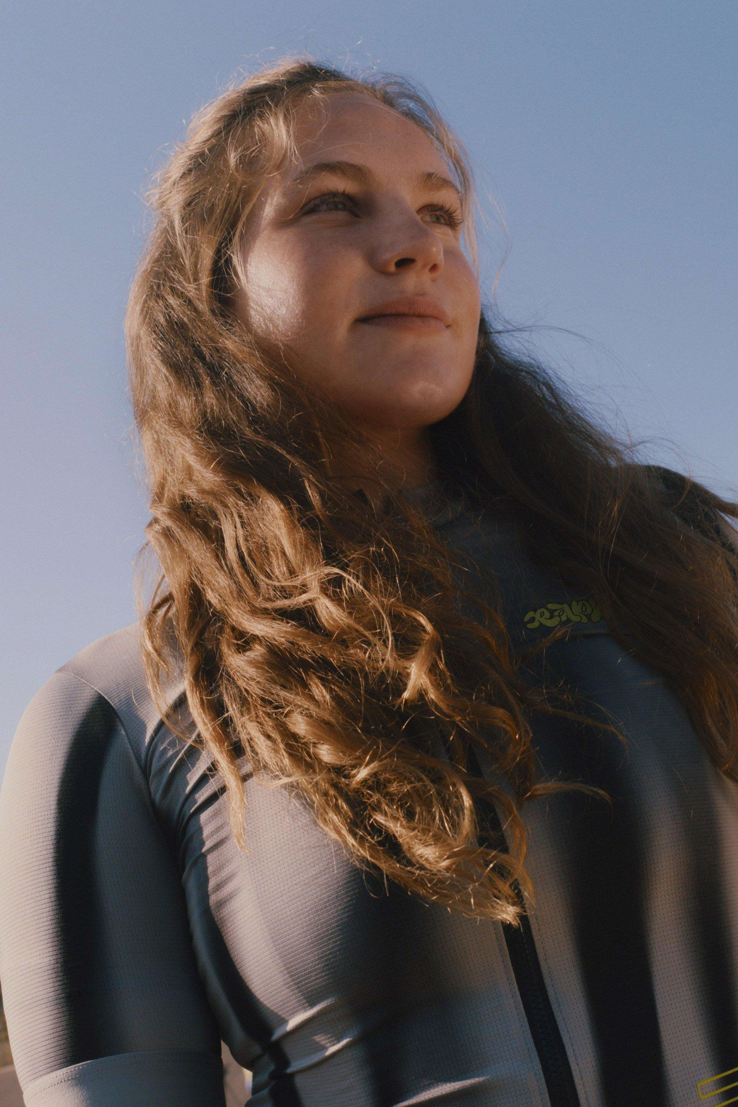
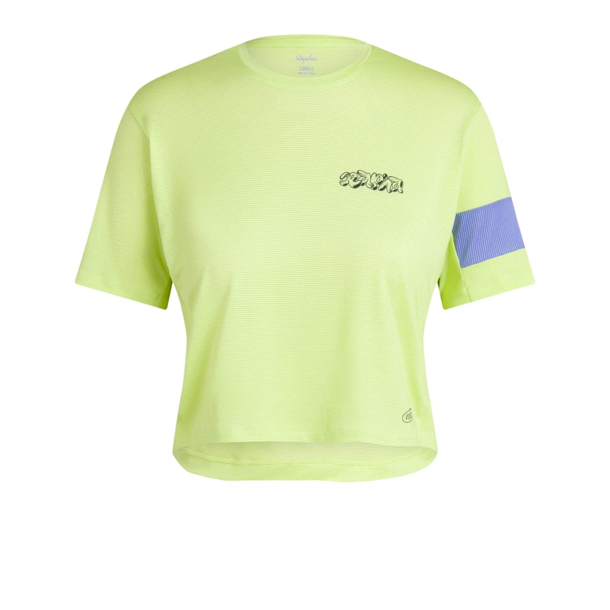
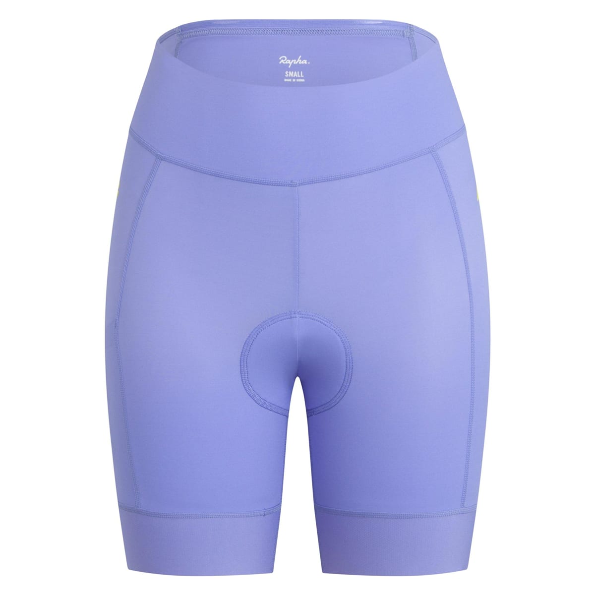
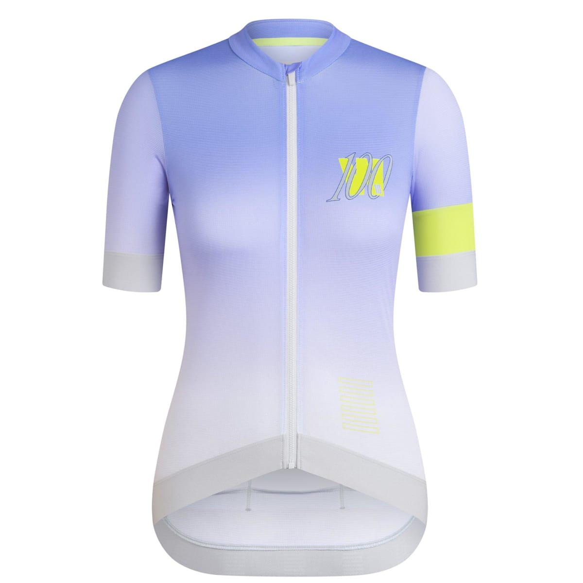
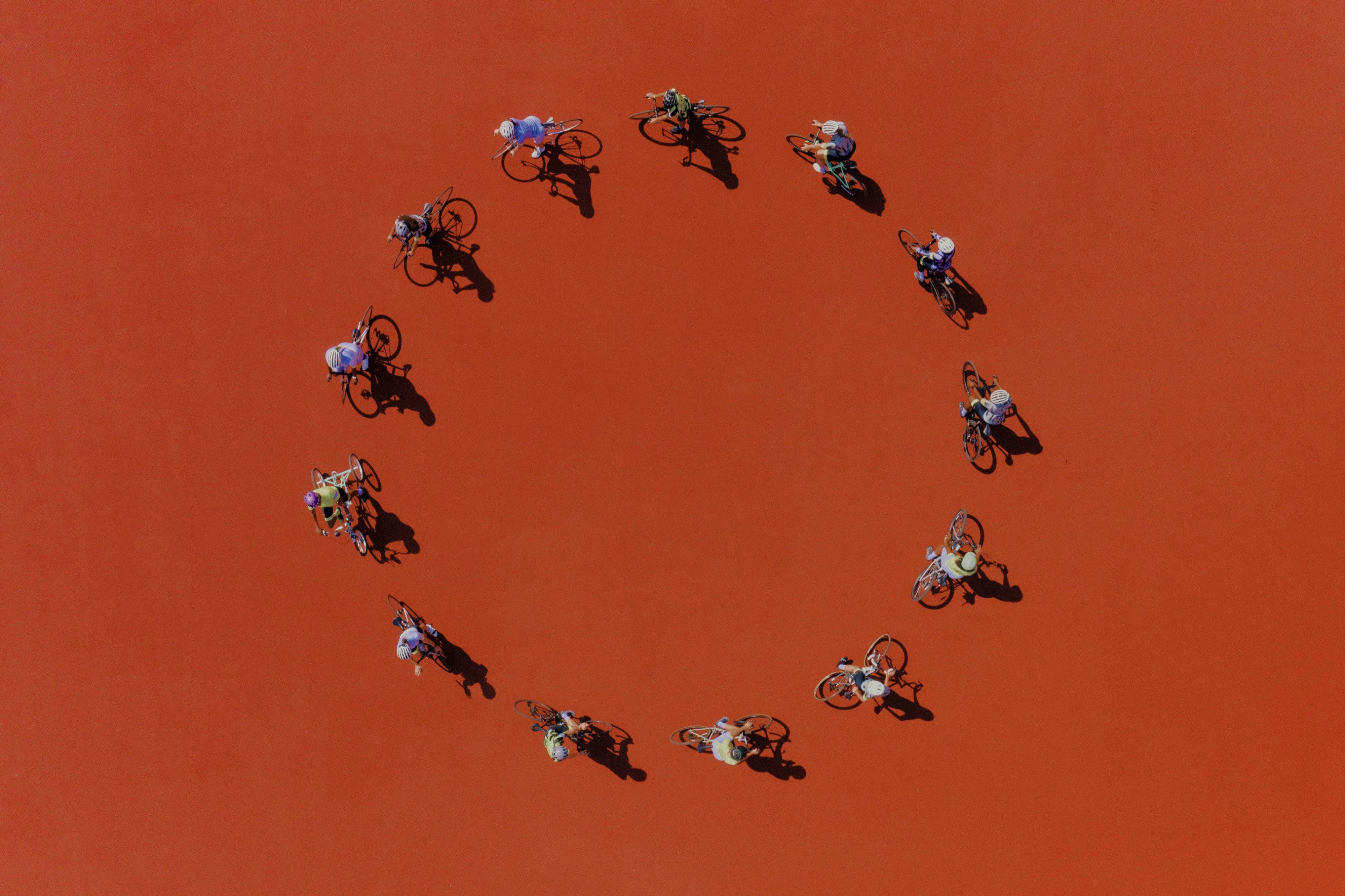
No go-getting, change-seeking, day-seizing sisterhood is complete without a uniform that sets them apart when out on the road, so we doubled up on the design with the expert help of both Zuzanna Rogatty and Studio Nari. Confident, colourful and created for every kind of rider, we spoke to the women behind the designs.
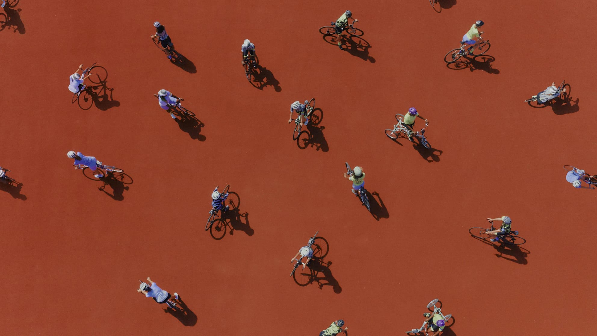
Meet the Designers
Celebrating ten years of women’s cycling, we’ve collaborated with not one but two world-class graphic designers for a very special Women's 100 collection.
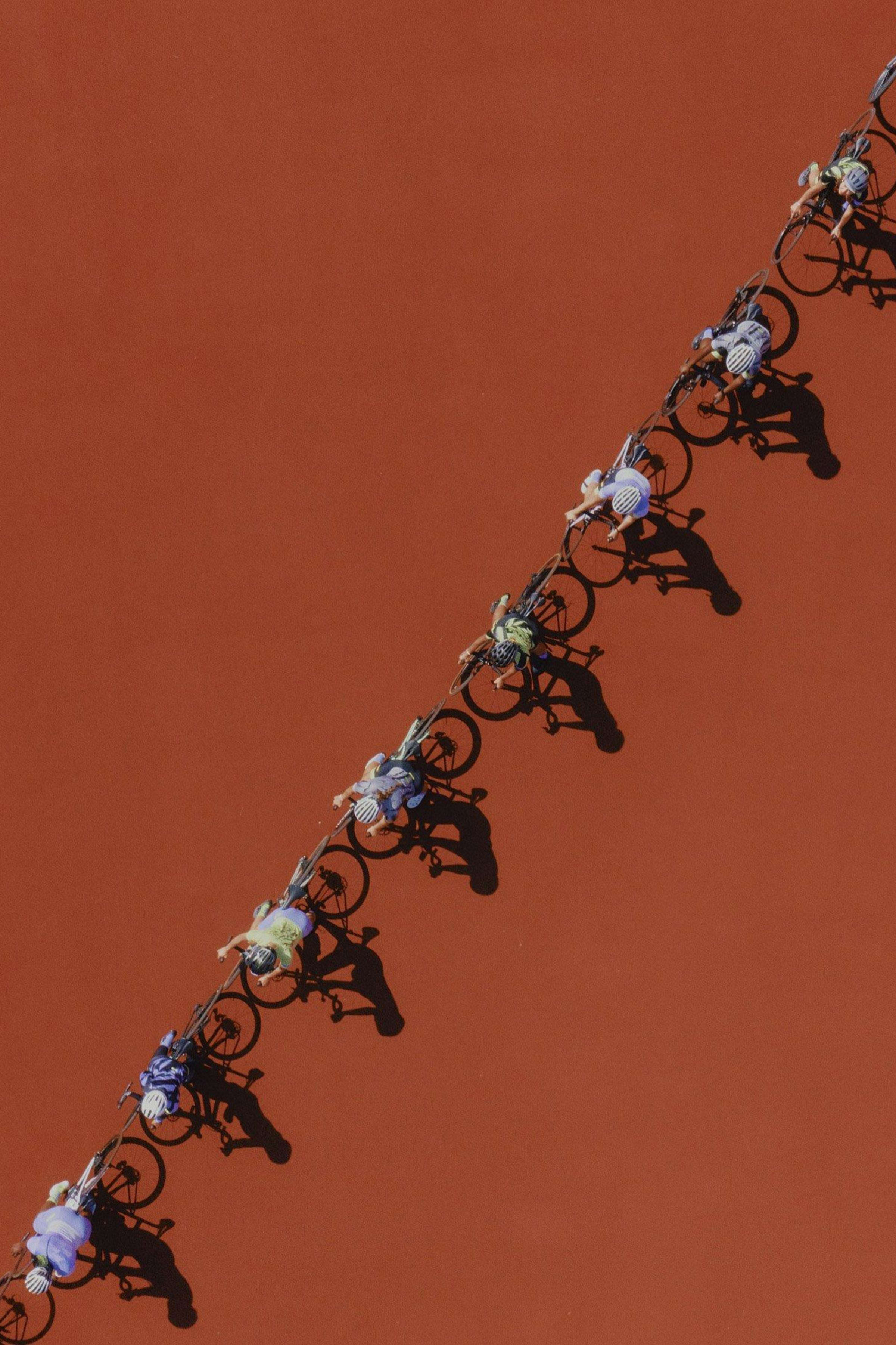
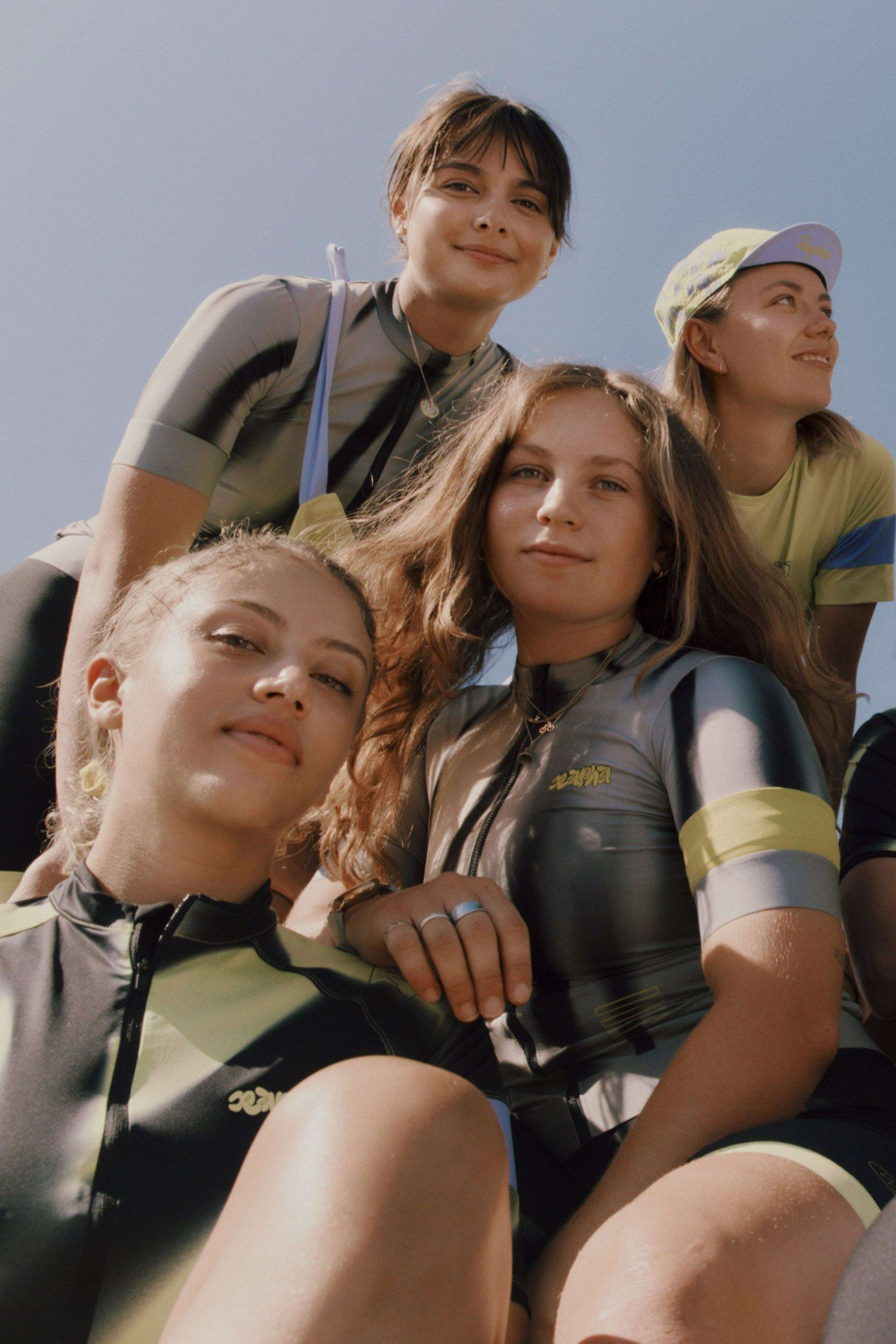

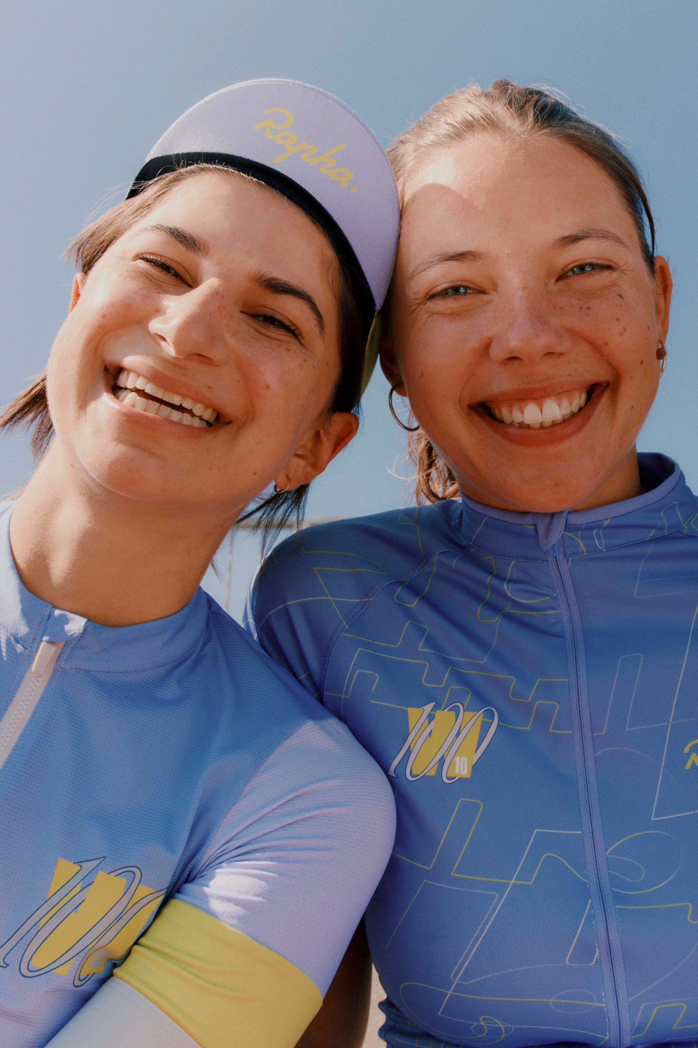
CATERINA BIANCHINI, STUDIO NARI
Empowering anthem = This Is The Day - The The
Words to live by = Tutto passa (everything passes)
“I left school early, I just knew it wasn’t for me. I studied medium format photography at college, and then went on to study graphic design at university, that’s where I got my interest in drawing and drawing type. I think both my own and the studio’s approach to design began there.”
“After moving to London, I started work in the corporate world but hated it, so I would spend my evenings making music flyers and creating brand identities for people. They all had next to no budget, but I did it for the portfolio. I then headed Boiler Room’s design for two years, which was a wild time, but the essence of what we do now goes back to those days: experimental and fun.”
Caterina Bianchini’s catalogue of clients and collaborators is a long and illustrious one.
She is founder of the highly renowned creative consultancy Studio Nari, whose designs are bold, beautiful and distinctly original - a perfect partner for this year’s W100 collection.
The name Studio Nari stands for ‘Not Always Right Ideas’, a mantra they apply to every project. “It’s the essence of the human, creative approach we have to things. It doesn’t need to look right, or like something you’ve seen before.”
“When it came to this collection, we ended up doing hundreds of designs to get to the final products. It was just so cool to be able to design a whole kit, we wanted to get it perfect. We had so many ideas, and just wanted to have fun with it.”
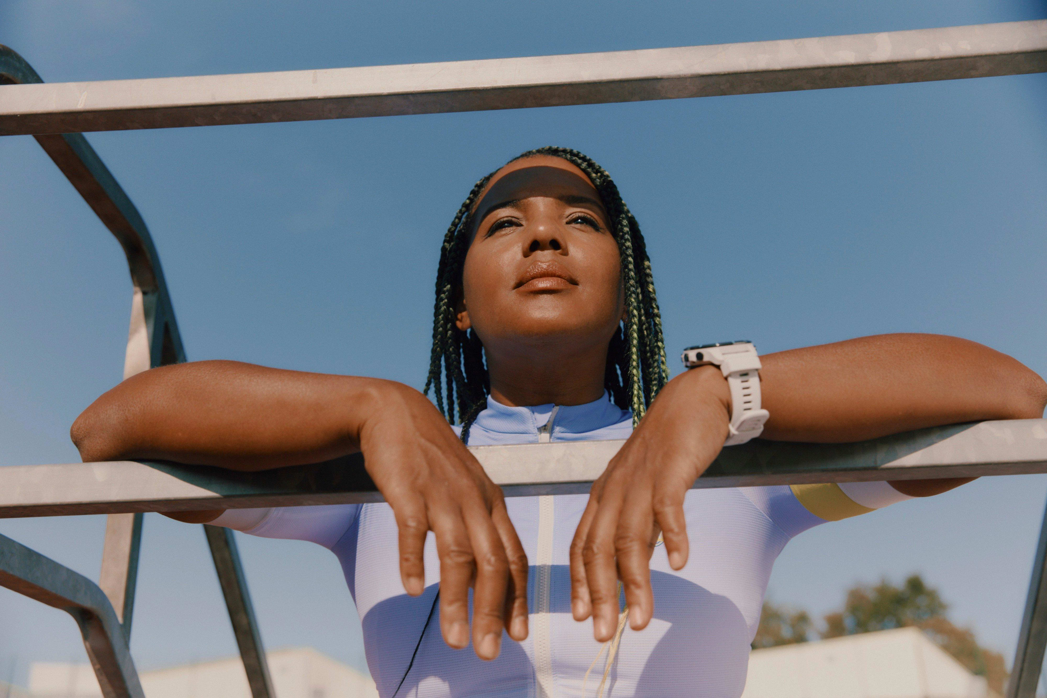
“We have our own typographers in the studio which is quite rare, so we thought it would be cool to apply our own typography on the ‘all my girls ride with me’ line. We wanted to create a really strong statement that looked bold, but also animated. The sort of squishy typeface feels like it's leaking into each other, there's a kind of energy and drive to it.”
“Sometimes you see someone wearing a t-shirt with a clever line on the back and it makes you smile, and we wanted people to feel like that. Like they could connect with it without having to know or say anything. That’s what the Women’s 100 represents, regardless of how much you ride, it’s about doing it and enjoying it, not how long it takes.”
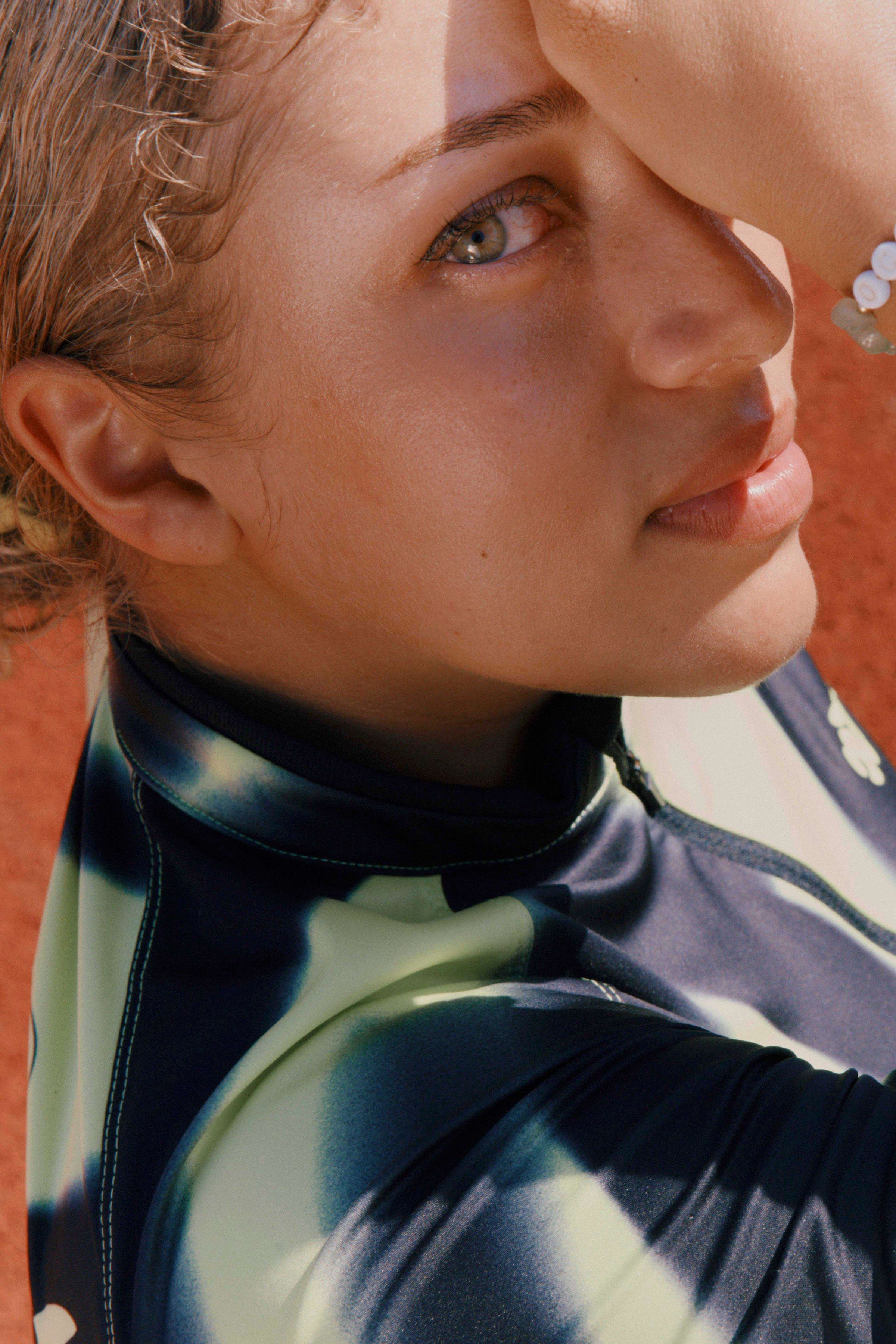
ZUZANNA ROGATTY
Empowering anthem = Queen Latifah - U.N.I.T.Y
Words to live by = Everything is going to be alright
“I used to live in New York, but when the pandemic hit I decided to move to Hawaii. I’d never been before and I didn’t know anyone there, but I just wanted to be able to surf every day. It ended up being the best decision. Now I get to live in paradise, and work remotely from there.”
“I love being outdoors. I hike and surf, and spend most of my time by the beach or in the mountains, and I love cycling. But when I was contacted by Rapha I thought okay, now it's time to get a road bike.”
Polish-born, Hawaii and New York-based graphic designer Zuzanna is a creative tour de force. Her style is optimistic and expressive, incorporating bold colours and playful forms in her wide range of work. She brought these characteristic qualities to her designs for this collection, and leant on a little old-school inspiration.
“It was a dream come true to design a collection for Rapha, and be able to do whatever I wanted with it was so special. When it comes to a new piece of work, my process always starts with research. For this collection, I looked at a lot of vintage cycling jerseys and retro cycling gear. It’s amazing how much of that stuff you could wear these days.”

“I then made a series of sketches, experimenting with various styles of letterforms and playing with scale, composition and colour. I think using duotone makes the collection seem timeless. Conceptually, I built the design around what the Women’s 100 stands for, solidarity, strength and boldness whilst maintaining a sense of playfulness and warmth. It celebrates the energy of that balance.”
Celebrating the joy, openness and inclusivity of the ride, whilst recognising the significance of its undertaking, Zuzanna’s designs are a perfect depiction of just what the Women’s 100 is all about.
